
Divi Theme FAQ
┬Ā
Table of content
- Creating New pages
ŌØÅ┬Ā┬Ā┬Ā┬Ā┬Ā Adding image
ŌØÅ┬Ā┬Ā┬Ā┬Ā┬Ā Adding text
ŌØÅ┬Ā┬Ā┬Ā┬Ā┬Ā Edit background colour
ŌØÅ┬Ā┬Ā┬Ā┬Ā┬Ā Edit background image
ŌØÅ┬Ā┬Ā┬Ā┬Ā┬Ā Admin label
┬Ā
- Design Option
- Duplicating Layout
- Copy & Paste Content
┬Ā
┬Ā
┬Ā
┬Ā
Divi Theme
┬Ā
Adding Sections, Rows, Modules (Including Text, Icons and Photos)
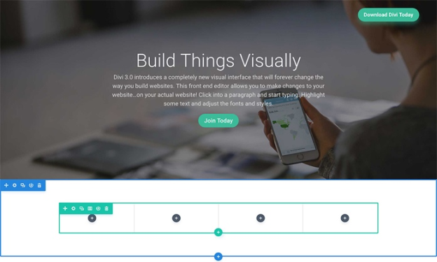
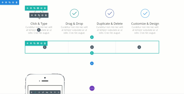
Before you can add anything to your page, you will first need to add a section. Sections can be added by clicking the blue (+) button. When you hover over a section that already exists on the page, a blue (+) button will appear below it.
┬Ā
┬Ā
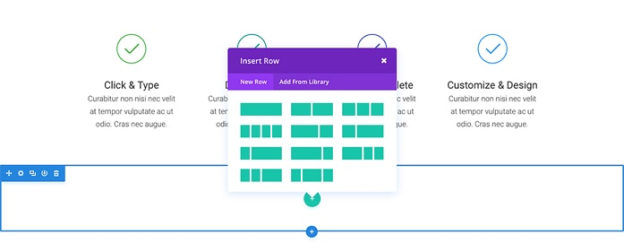
A section can house any number of rows, and you can mix and match rows of varying column types to create a variety of layouts.
To add a row, click the green (+) button inside of any empty section, or click the green (+) button that appears when hovering over any current row to add a new row below it. Once you have clicked the green (+) button you will be greeted with a list of column types.
┬Ā
┬Ā
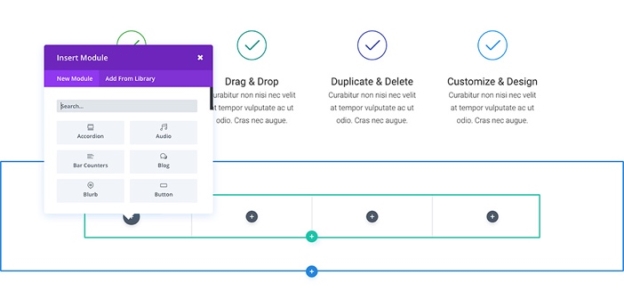
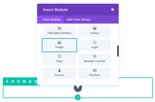
Modules can be added inside of rows, and each row can house any number of modules. Modules are the content elements of your page. You can use basic modules such as Text, Images and Buttons, or more advanced modules like Sliders, Portfolio Galleries and eCommerce Shops.
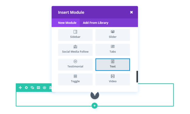
To add a module, click the gray (+) button that exists inside of any empty column or click the gray (+) button that exists when hovering over a module on the page to add a new Module below it. Once you have clicked the button, you will be greeted by a list of modules.
Use these steps to add content such as photos and texts.
┬Ā
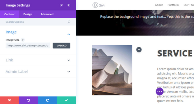
Add image
┬Ā
Add text
┬Ā
┬Ā
┬Ā
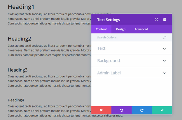
Text Content
This field is where you can enter the body content of your module. Text content spans the full width of the column that it is in.
If your text is being placed onto a dark background the Text Color should be set to ŌĆśDarkŌĆÖ. Visa versa, if your text is being placed onto a light background, the Text Color should be set to ŌĆśLightŌĆÖ.
Background Color
Here you can choose a background color for your text module.
Background Image
Here you can choose a background image for your text module.
Admin Label
By default, your text module will appear with a label that reads ŌĆśTextŌĆÖ in the builder. The Admin Label allows you to change this label for easy identification.
Design Options
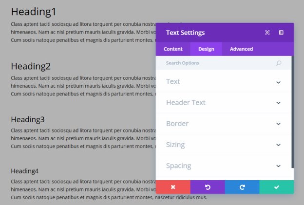
Here you can style and/or position your text or header text just how you want it by choosing the text color, orientation, font, font size, font spacing, and line height.
You can also designate a border style, set a max width for your module, and add custom margin and padding.
┬Ā
┬Ā
Saving A Layout
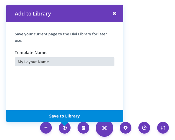
Once you have created a layout, you can save it for later use by click the ŌĆ£Save LayoutŌĆØ button at the bottom of the builder interface. Once you click the save layout icon, a popup will prompt you to name and save your layout. Type in your desired name, which will be used to identify the layout when loading it in the future, and click the save button. ThatŌĆÖs it! Your layout has now been saved.
┬Ā
┬Ā
┬Ā
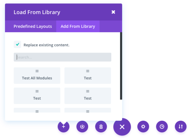
Loading A Saved Layout
Once you have saved a layout, you can load it at any time by clicking on it in the load from library popup. Loading a layout will populate the page that you are editing with the sections, rows and modules that you saved in the layout. When you load a saved layout, it will delete whatever content is currently on your page and replace it with the save layout unless you uncheck the ŌĆ£replace the existing content with loaded layoutŌĆØ option before loading.
┬Ā
Copy & Paste content
┬Ā
┬Ā
┬Ā
┬Ā
┬Ā